Documentation
My Data Visualization Journey
Design Process
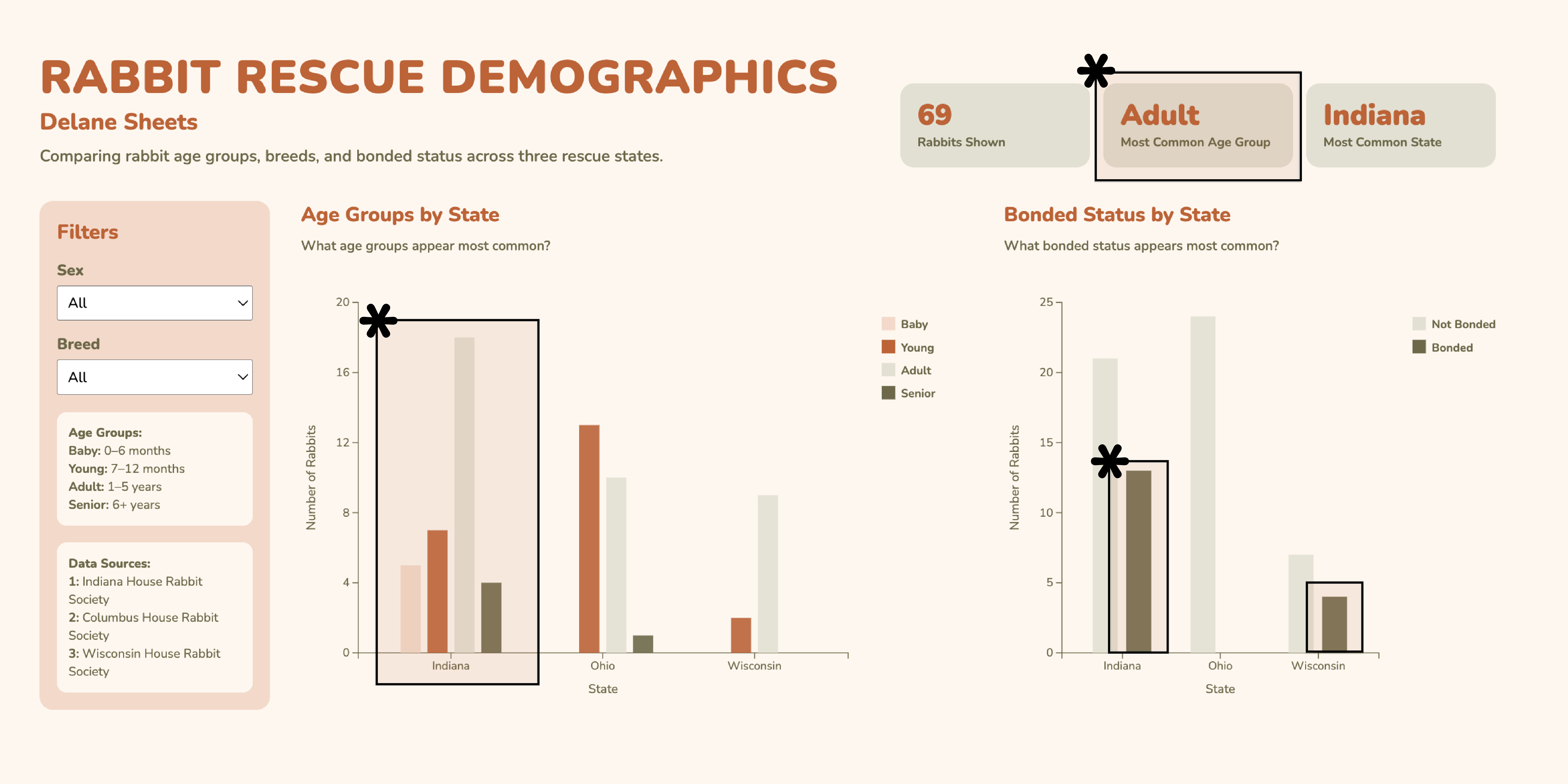
I knew right away that I wanted to connect this data visualization project to my capstone. My capstone centers around connecting rabbit owners and adopters to local nonprofit rabbit rescues. Within my app prototype, I have an adoptable rabbits screen connected to the IHRS. By comparing the rabbits within the Indiana House Rabbit Society to the rabbits at the Columbus and Wisconsin House Rabbit Societies, I am able to show how many rabbits are overlooked in Indiana.
I decided to focus on three states in order to show a better comparison. I wanted to explore the attributes such as age groups, breed, sex, and bonded status. I initially considered putting everything into one chart while including trend lines and textured bars, but it quickly became overwhelming. Instead, I decided to separate the data into two main comparisons: age groups by state and bonded status by state. This made the patterns easier to read, as well as more visually intriguing.
I then decided to add filters for sex and breed so that users could interact with the data rather than viewing a static chart. Throughout this process, I iterated on layout and spacing to make the design feel balanced and easier to understand.
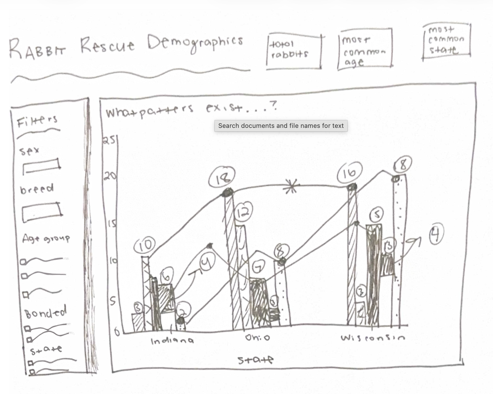
Original Sketch:
Rationale of Design Choices
I decided to use the color palette within my capstone project for consistency. I also love how the nature-inspired hues give off a friendly and calming feeling. The orange and greens help distinguish the categories as well. I decided to make the bars ordered using light to dark variation, which helps separate the categories visually. The spacing between the bars helps with this as well.
I ended up choosing grouped bar charts because they allow for an easy comparison across the states while still showing variation within each category. The filter panel is placed on the left as the main interaction point. The charts and summary cards update based on selected filters as well. In addition to this, the summary cards are used as quick summaries of the visualization while the user is clicking through, which allows for an easy understanding. I also decided to implement a hover tool that reiterates the age groups and shows a list of rabbit names. This addition to my design makes it feel more personalized and realistic. I also decided to include a smooth transition when filters are applied so that the data changes feel more natural and pleasing.
Discovery
The main question I explored was: What patterns exist among adoptable rabbits across different rescue states?
One clear finding is that adult rabbits are the most common age group across all states. I also found that between these three rabbit societies, the Indiana House Rabbit Society has the most rabbits who need homes.
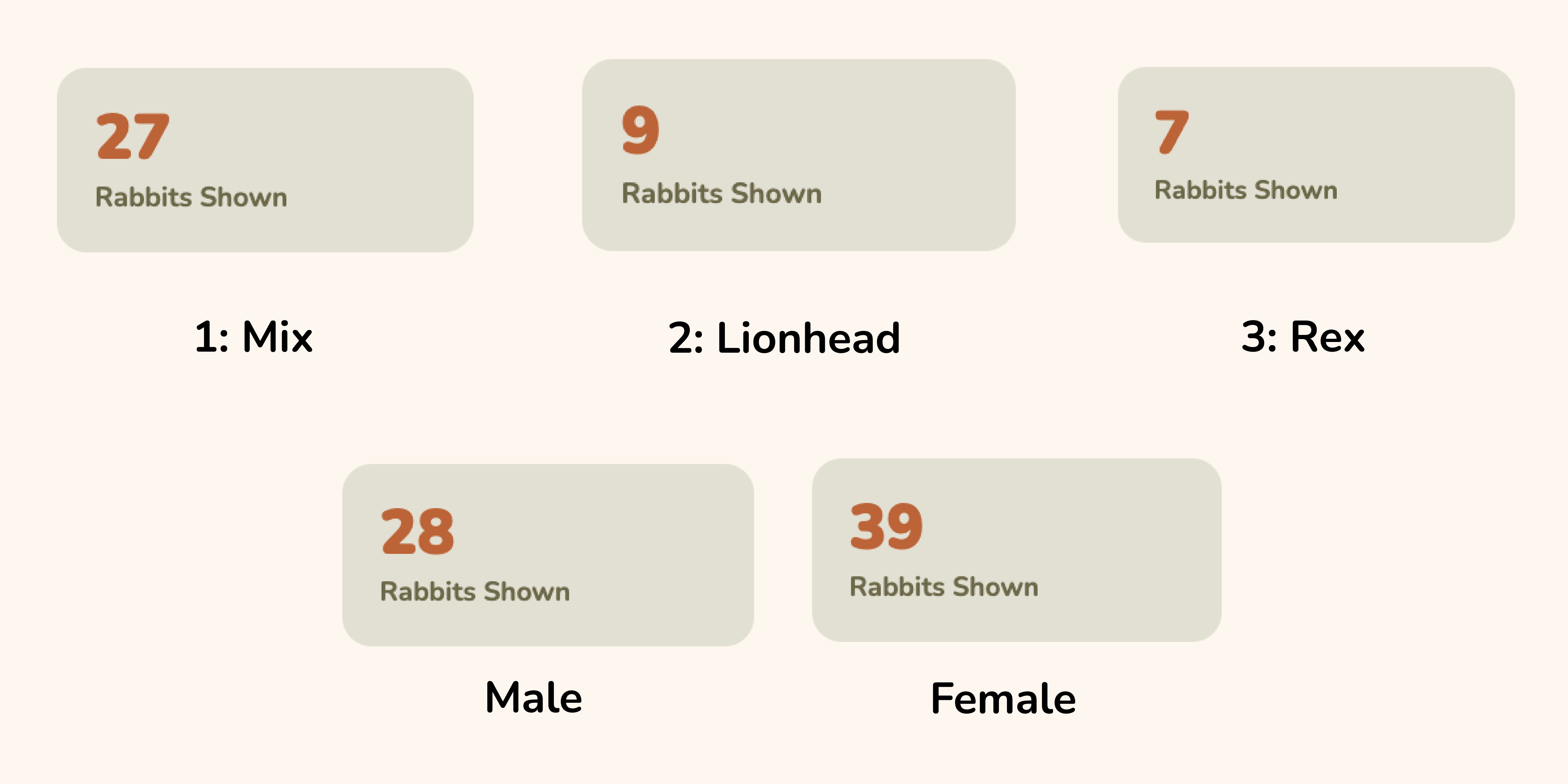
Most of the rabbits are not bonded, but this can change when filtering by breed or sex. As for the breeds, the most common breed is mixed rabbits. This isn’t a surprise, considering so many breeders keep mixing the genetics of rabbits, which sadly isn’t stopping. As for the second highest breed, these are lionheads, and the third highest breed are rex’s. Another finding is that there are more female rabbits within this dataset than male.
By using the filters, it is easier to explore smaller subsets of the data and see how specific breeds or categories differ from the overall trends.
Evidence: